Ubilympics
Spring 2020 Internship Project - Ubisoft
Annual Ubisoft Company Meeting Branding under the Art Direction of Brian Tippie
During my internship at Ubisoft, I was given the opportunity to act as lead designer on a new project that involved branding their annual company meeting. The event was to take place at the end of my 3 month internship and would accommodate over 500 guests. It required all of the necessary assets to put on an event of that scale: brand identity, invitations, save the dates, posters, banners, wall graphics, and so much more. The original theme for the meeting was the Olympics, because it was to be held in May 2020, only a few months before the summer Olympics. Two months into working on this project, the COVID-19 pandemic turned everything on it’s head. Our company meeting was changed from an in-person event to a virtual one and our theme was changed to avoid being insensitive to the cancellation of the 2020 Olympics. Nearly two months of work was put into the original project and I’m still very proud of everything I created. Below, I’ve outlined the entire process and mocked-up as many assets as I could in order to show what the event would have looked like.

Initial Brainstorming
To start this process, I created four different “buckets” of inspiration based on three different ways that our Olympic theme could be taken.
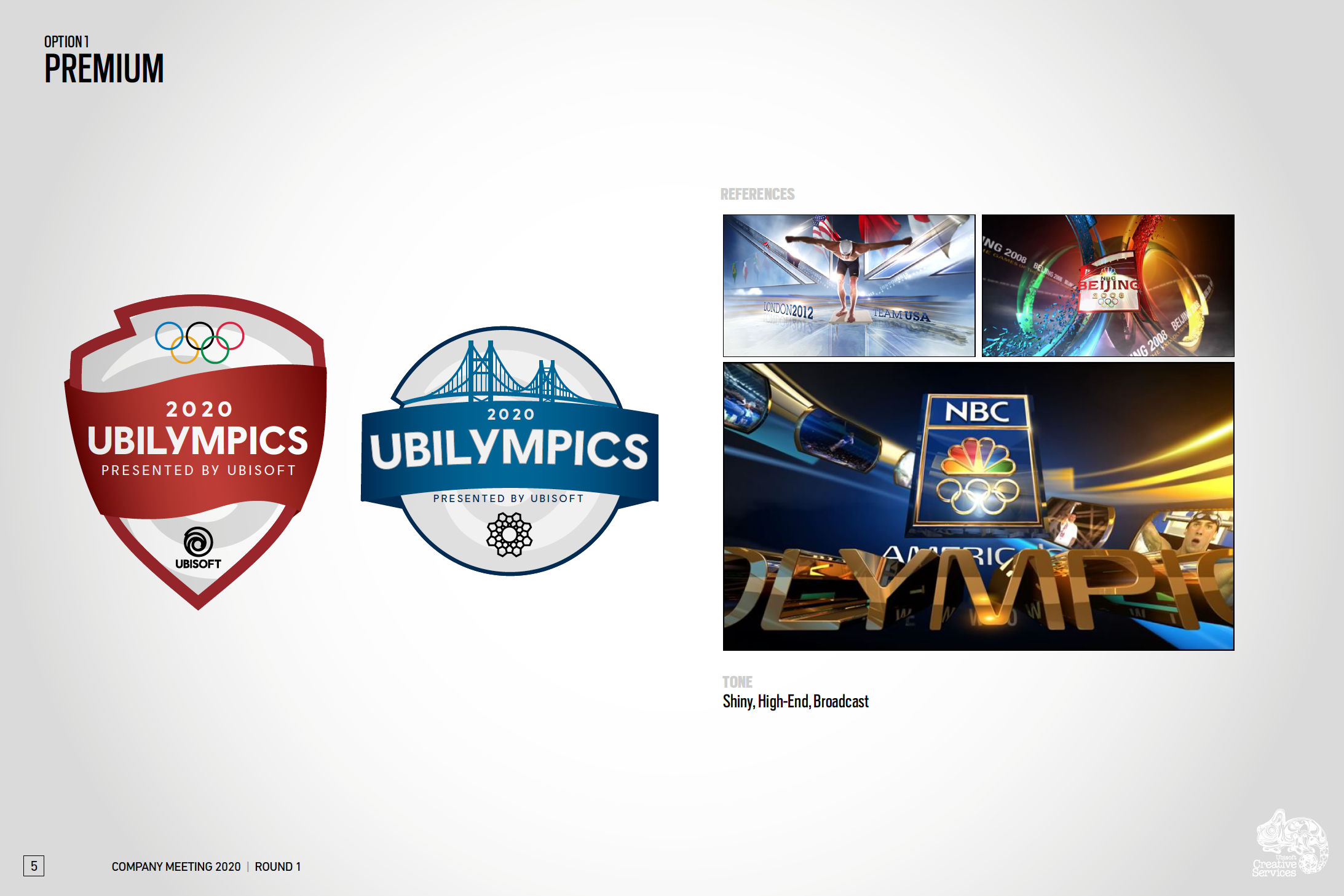
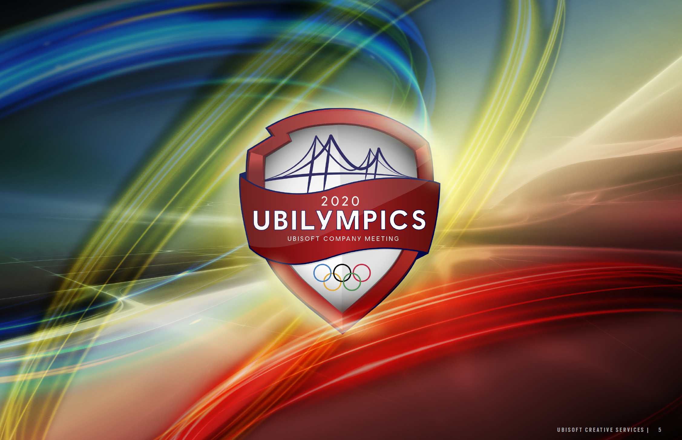
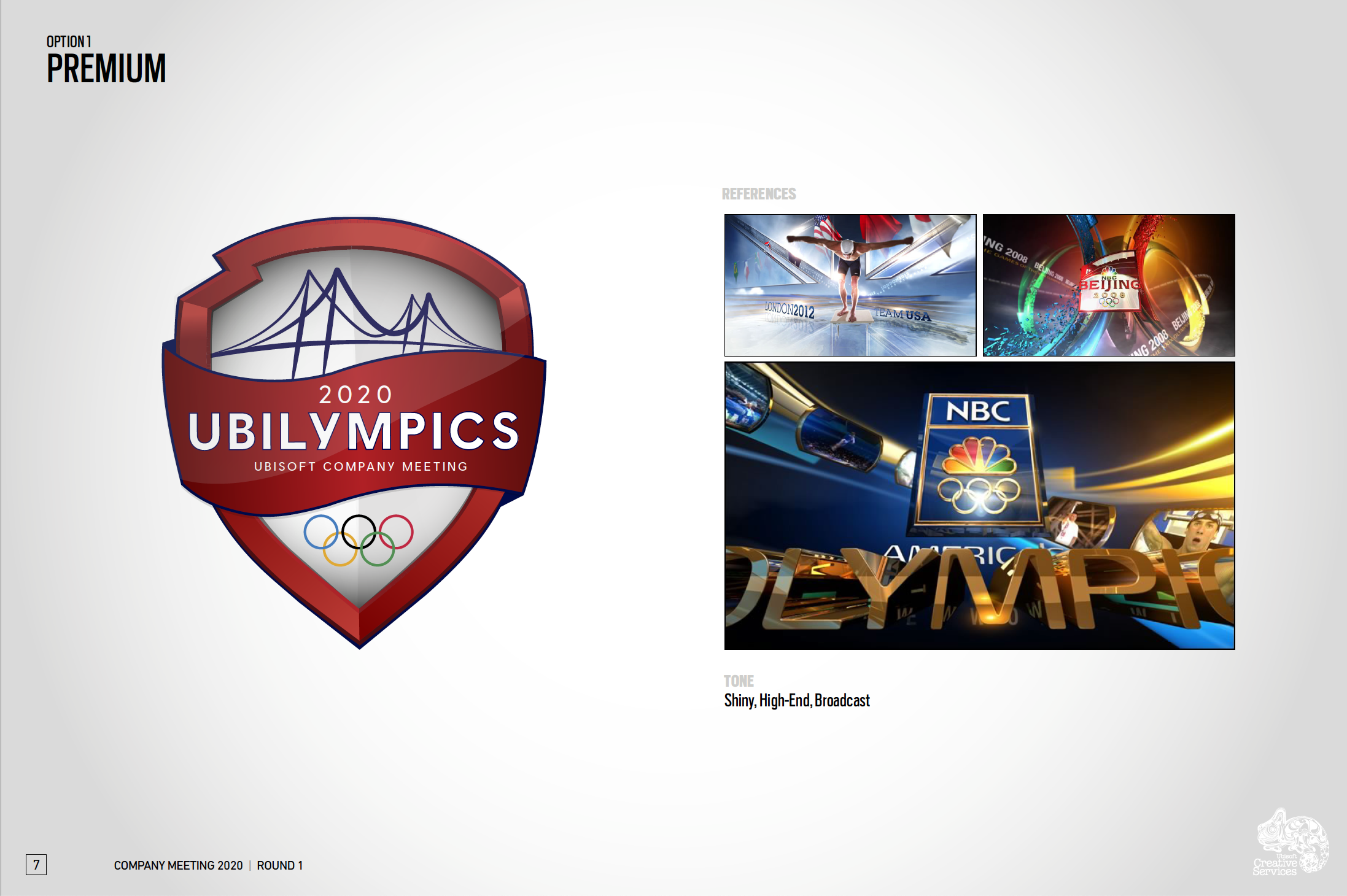
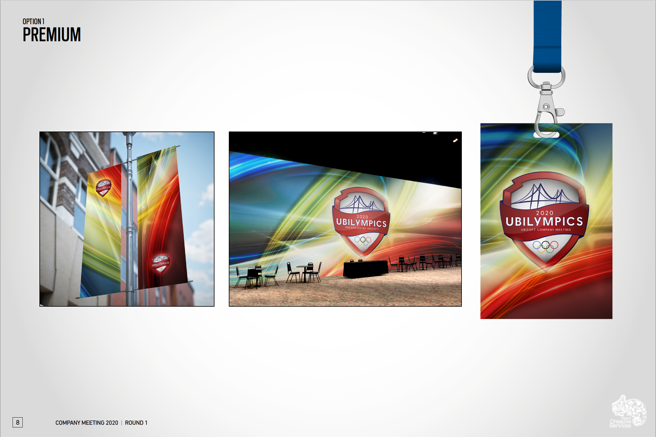
Premium - a nod to the typical network coverage of the olympics
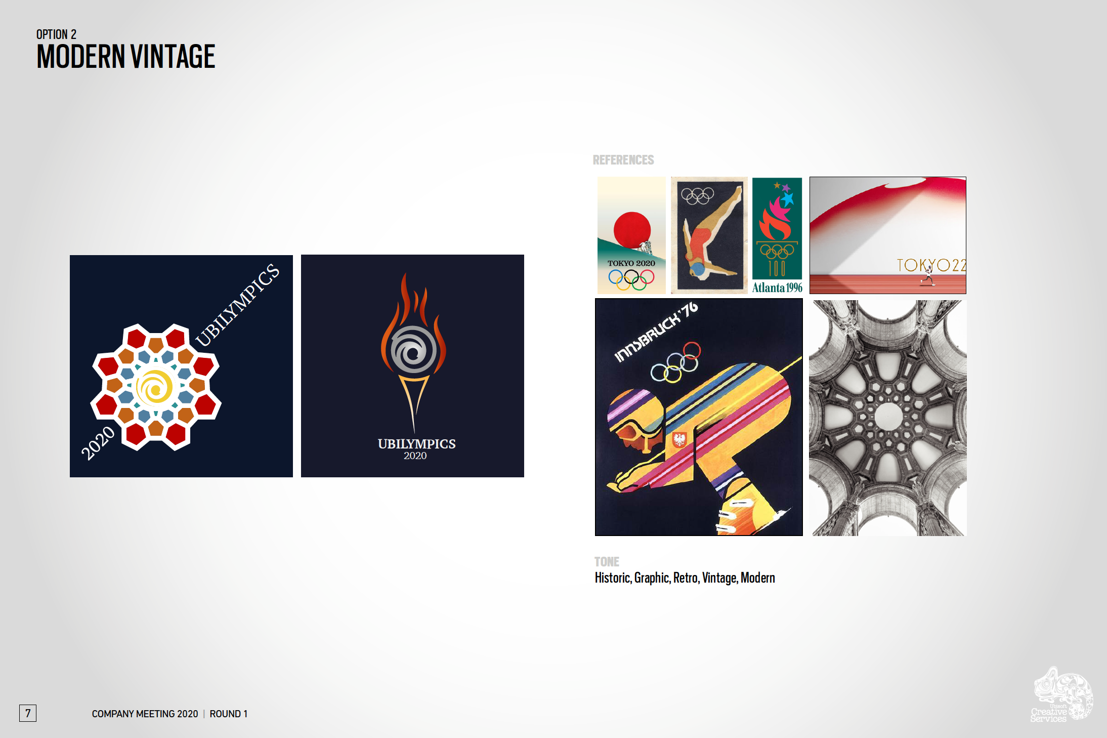
Modern Vintage - a look back at the rich history of the annual games
Bright Movement - taking inspiration from branding of recent games
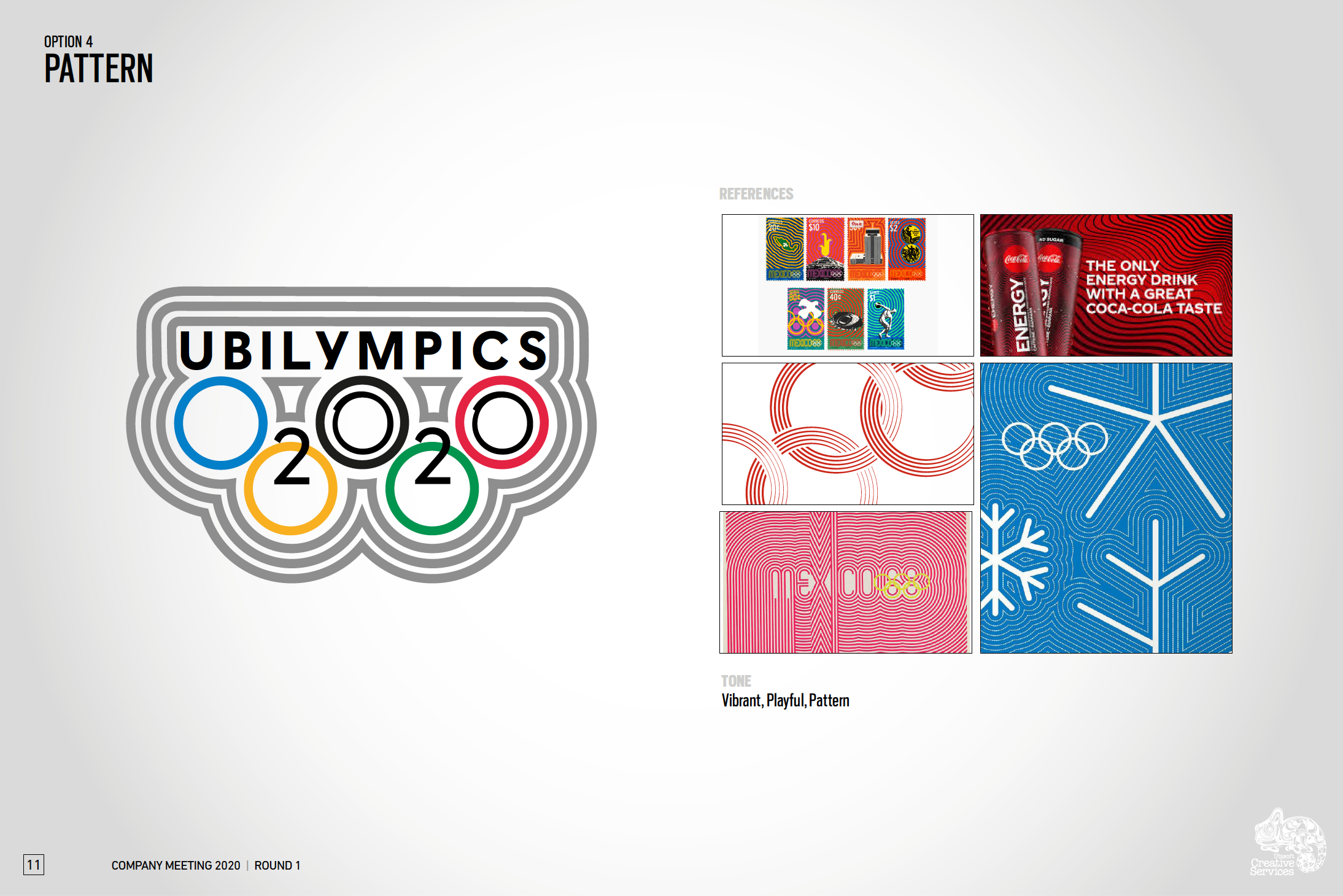
Radial Retro - looking back at past games, specifically Mexico ‘68
Round 1
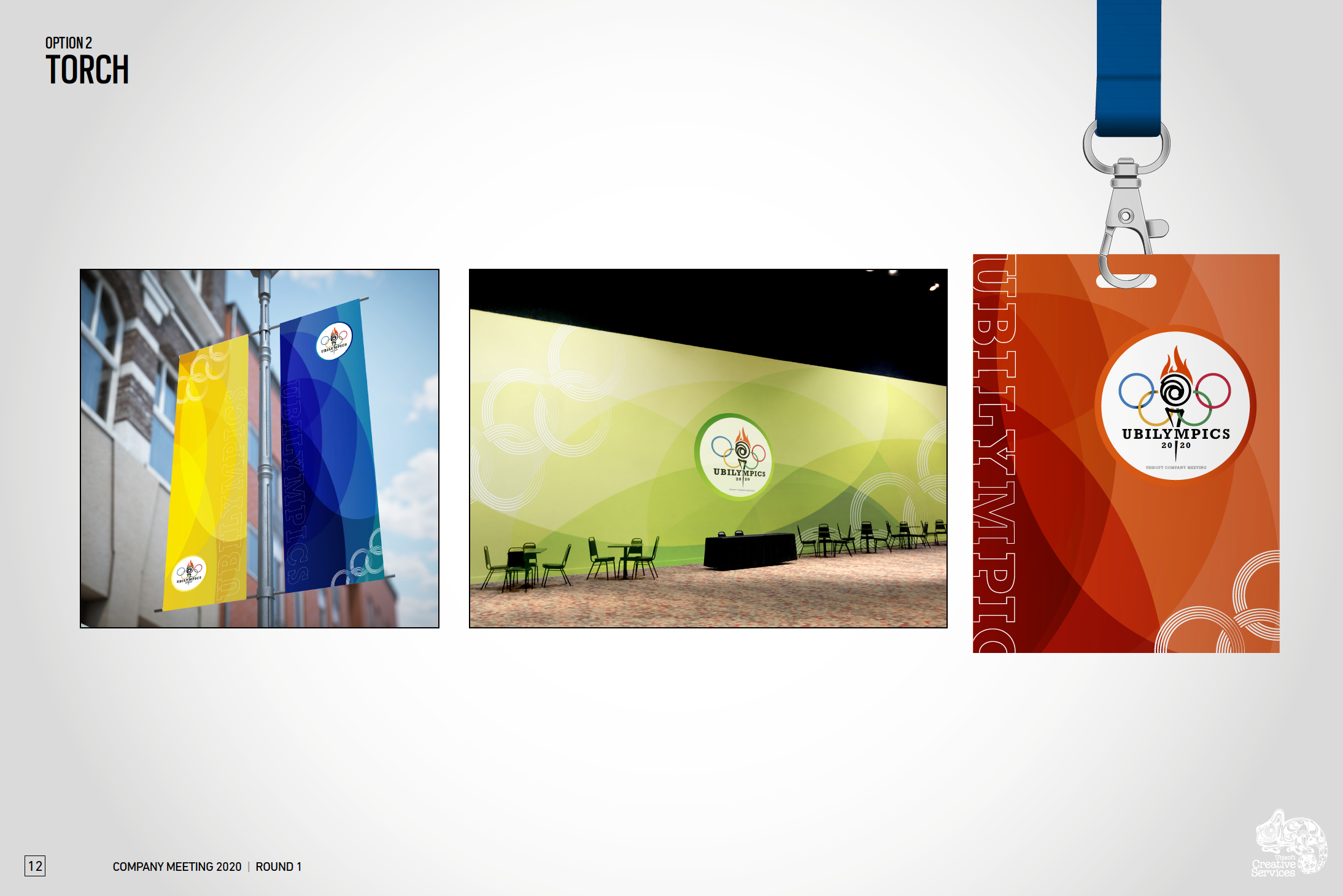
The next step in the process was to create potential logos for each direction and mock up some assets in order to give a well-rounded view at what the event might look like for each option.
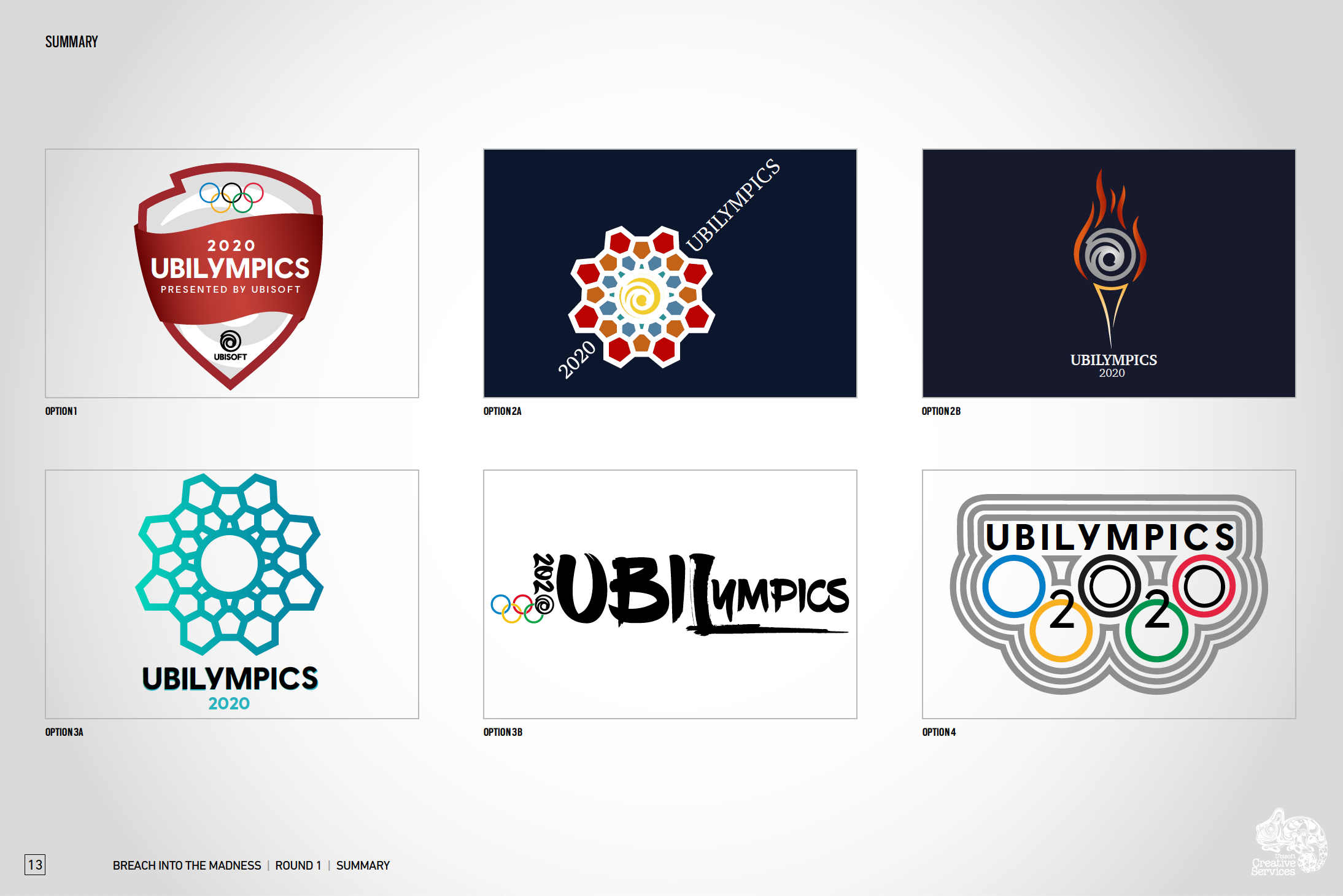
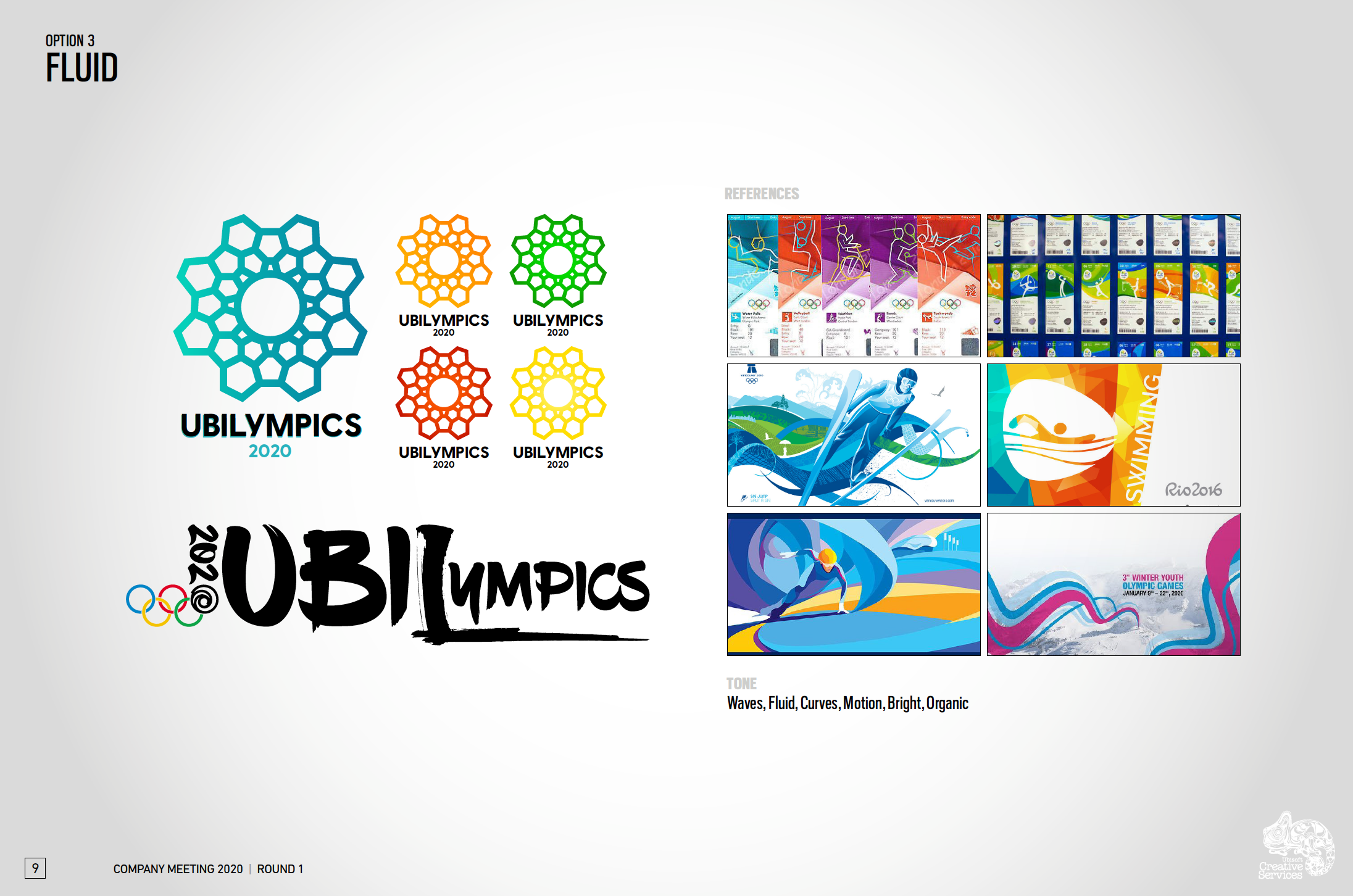
*Fluid option 3B was designed by another designer and is not my work
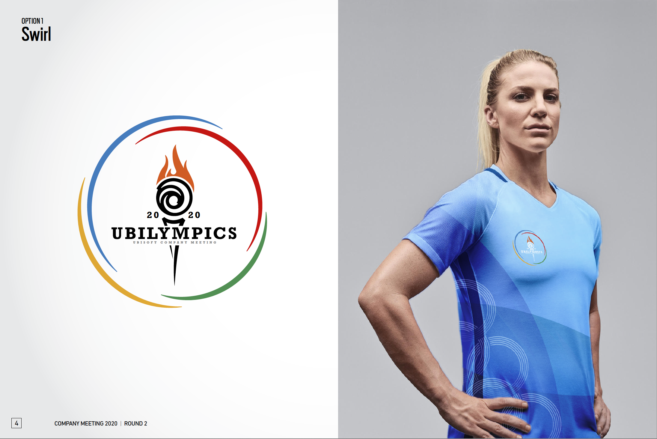
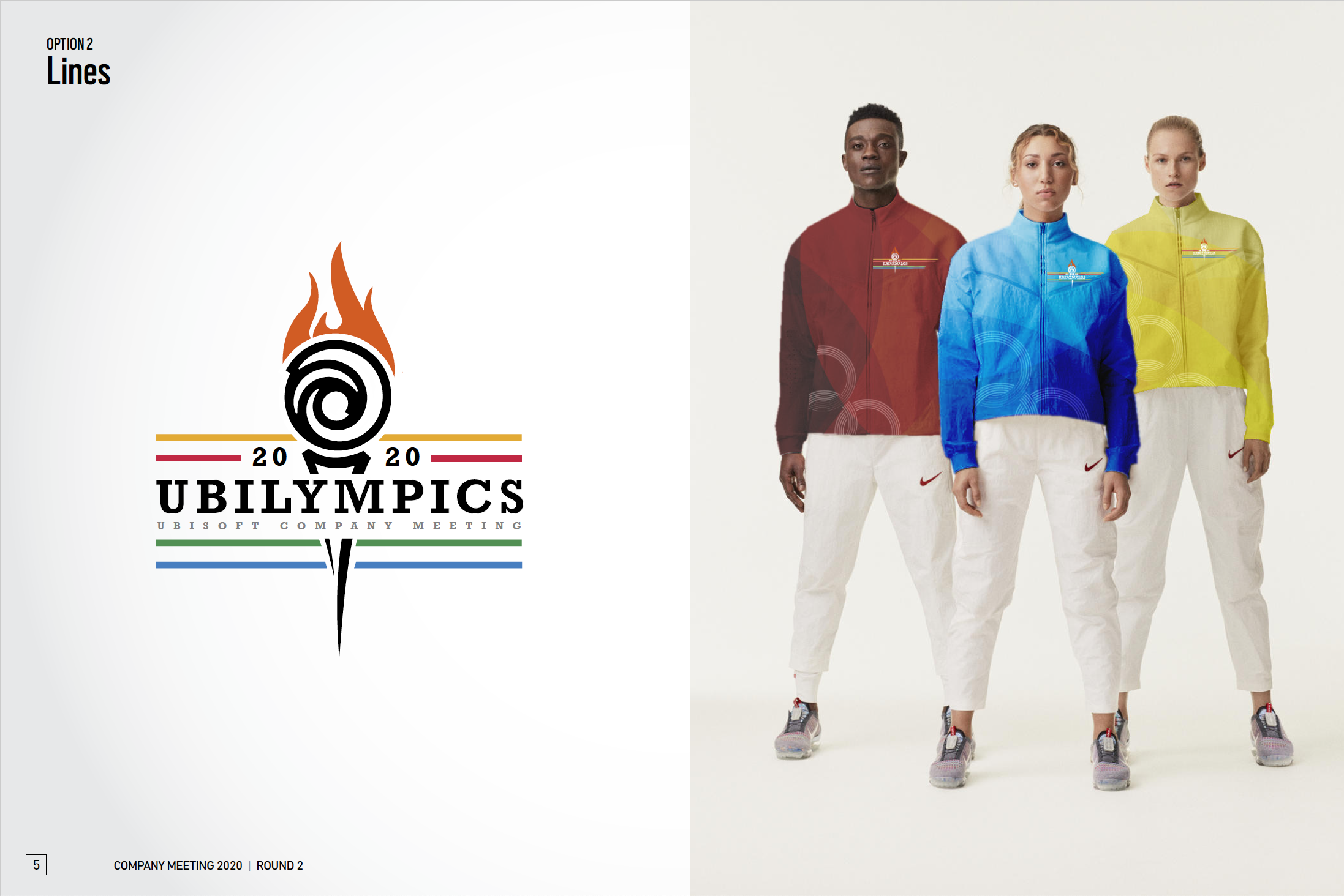
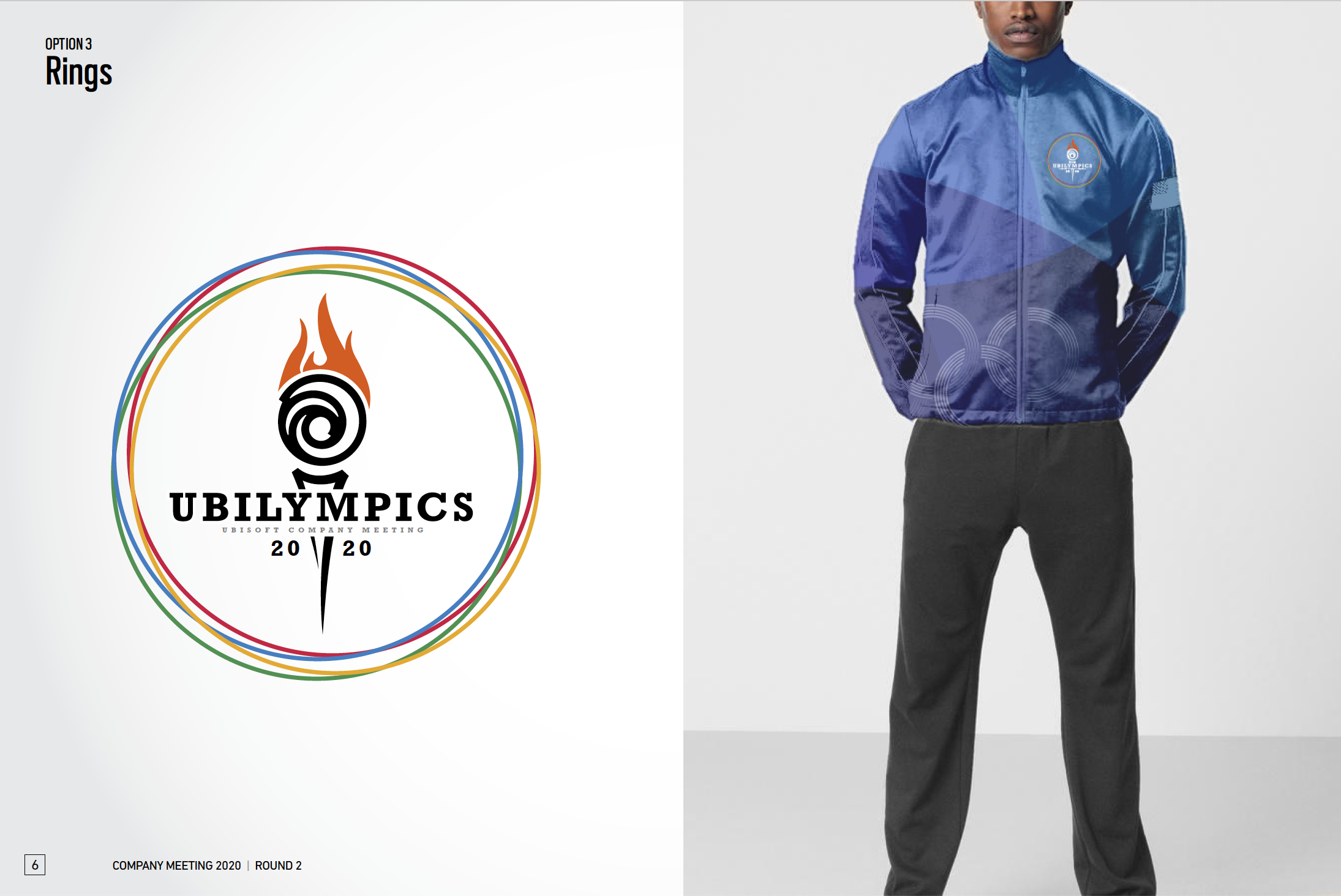
Round 2
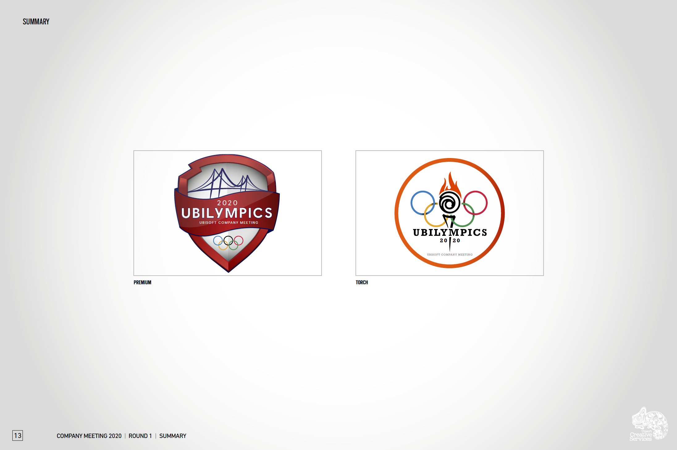
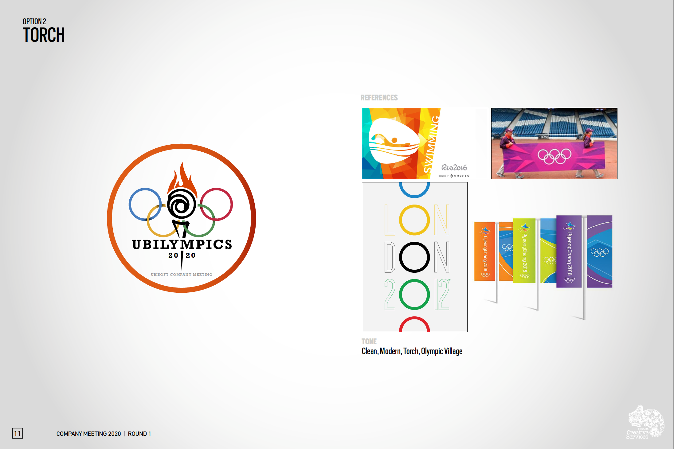
After presenting our initial designs to the team, we narrowed it down to two options: Premium and Modern Vintage. They liked the premium logo because of how reminiscent it was to the theme and how recognizably “Olympics” it was. They liked the modern vintage option because of it’s nod to the Olympic torch. For this round, we wanted to lean into the things that they were responding to and present them with more refined options.
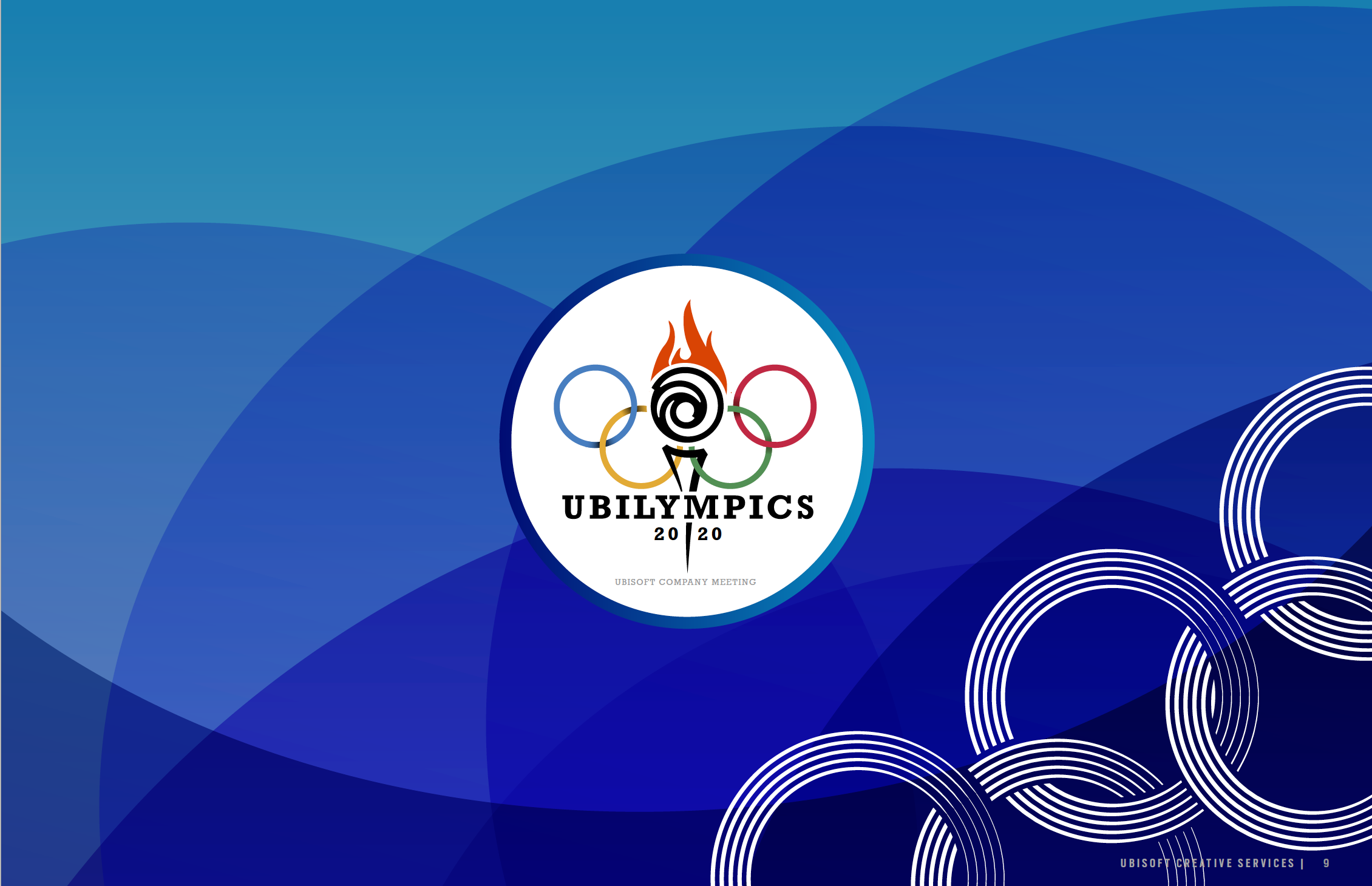
The option that was selected was the Torch.
Round 3
For the final round of logo refinement, the main goal was to create a version of the selected logo that did not include the Olympic rings. Due to legal clearances, we were not permitted to use the image of the rings outside of the venue. Because of this, we chose to explore new options for the logo that captured the essence of the Olympic rings but could still be used both inside and outside of the venue.
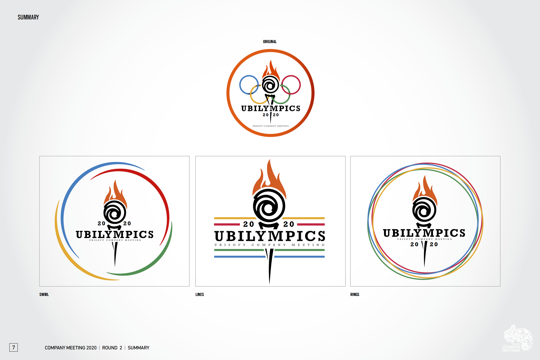

Final Logo
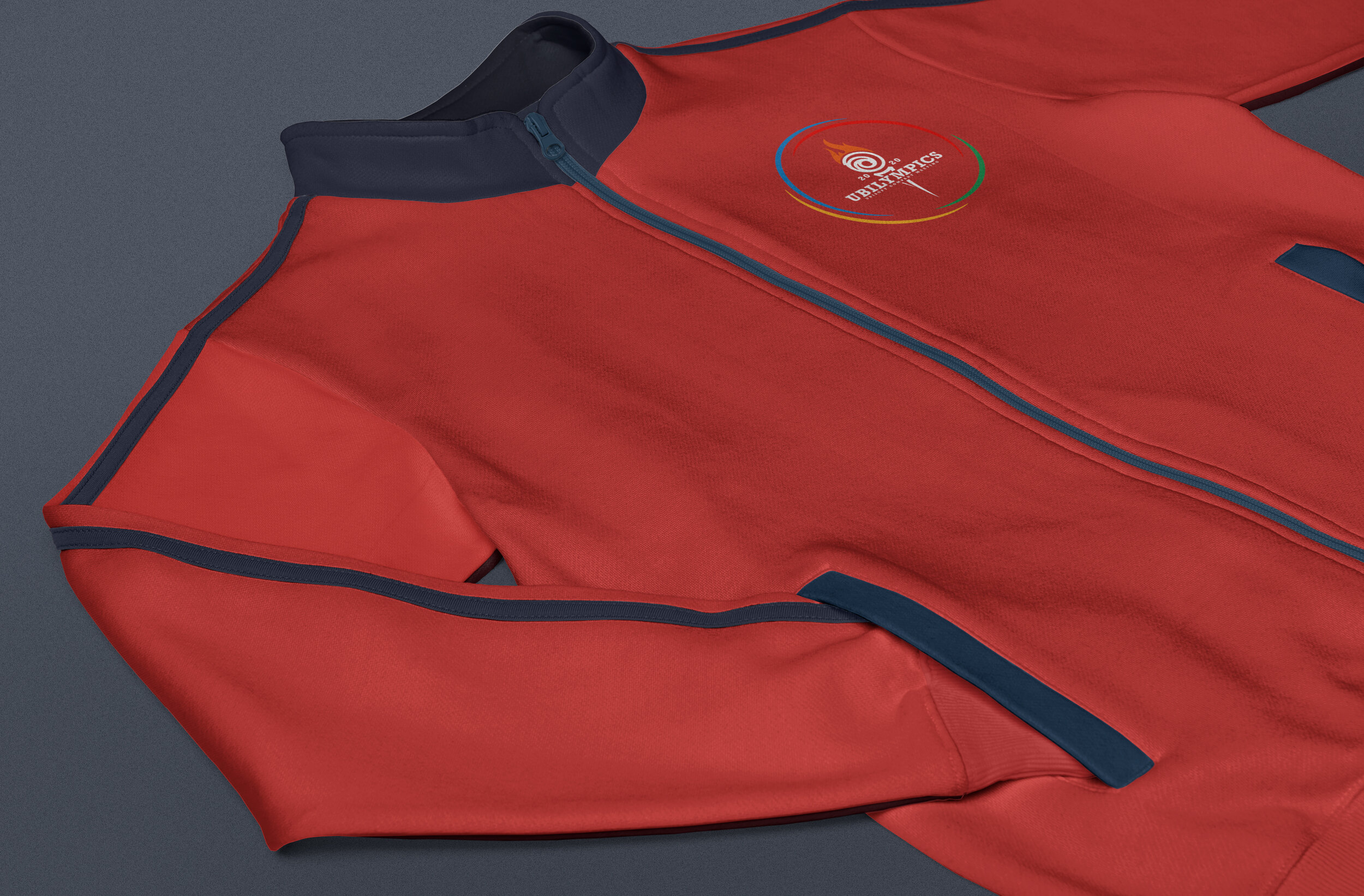
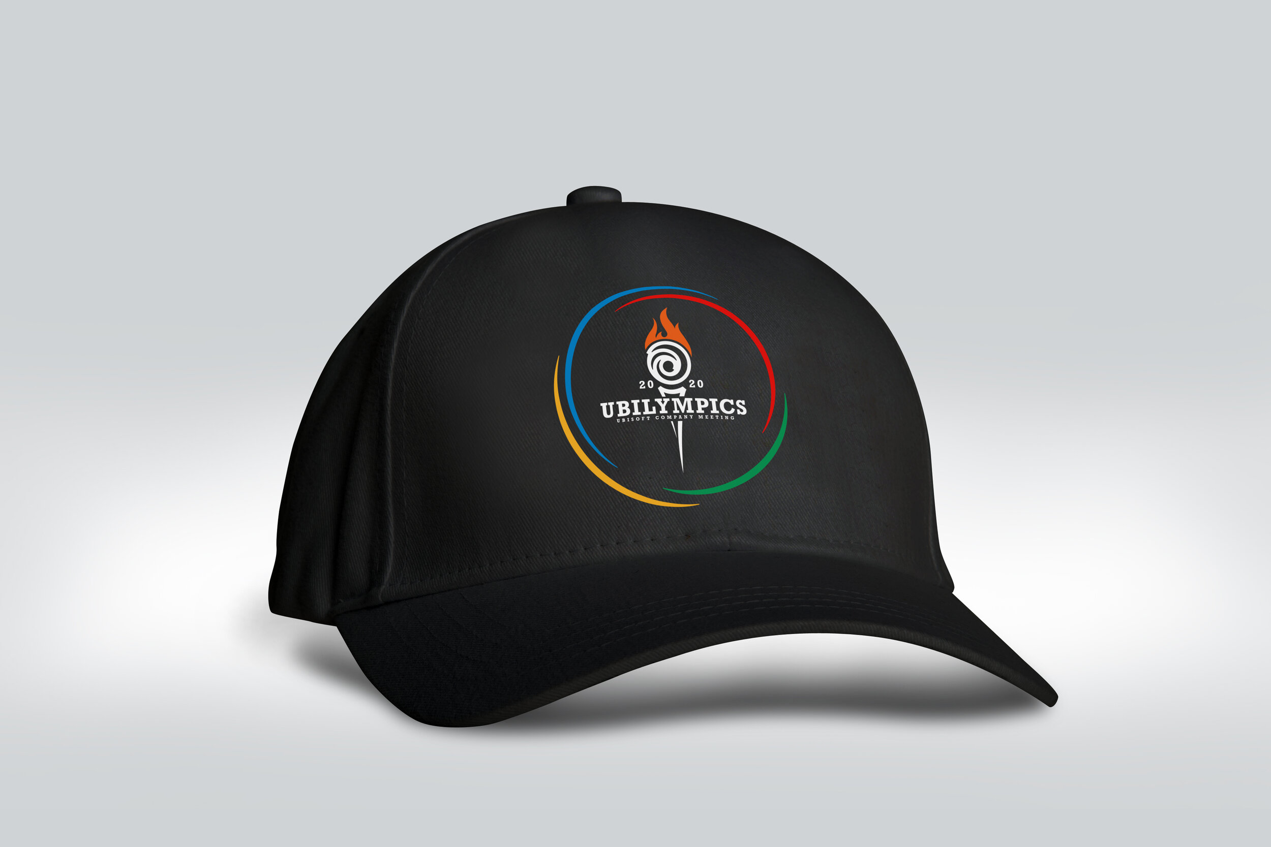
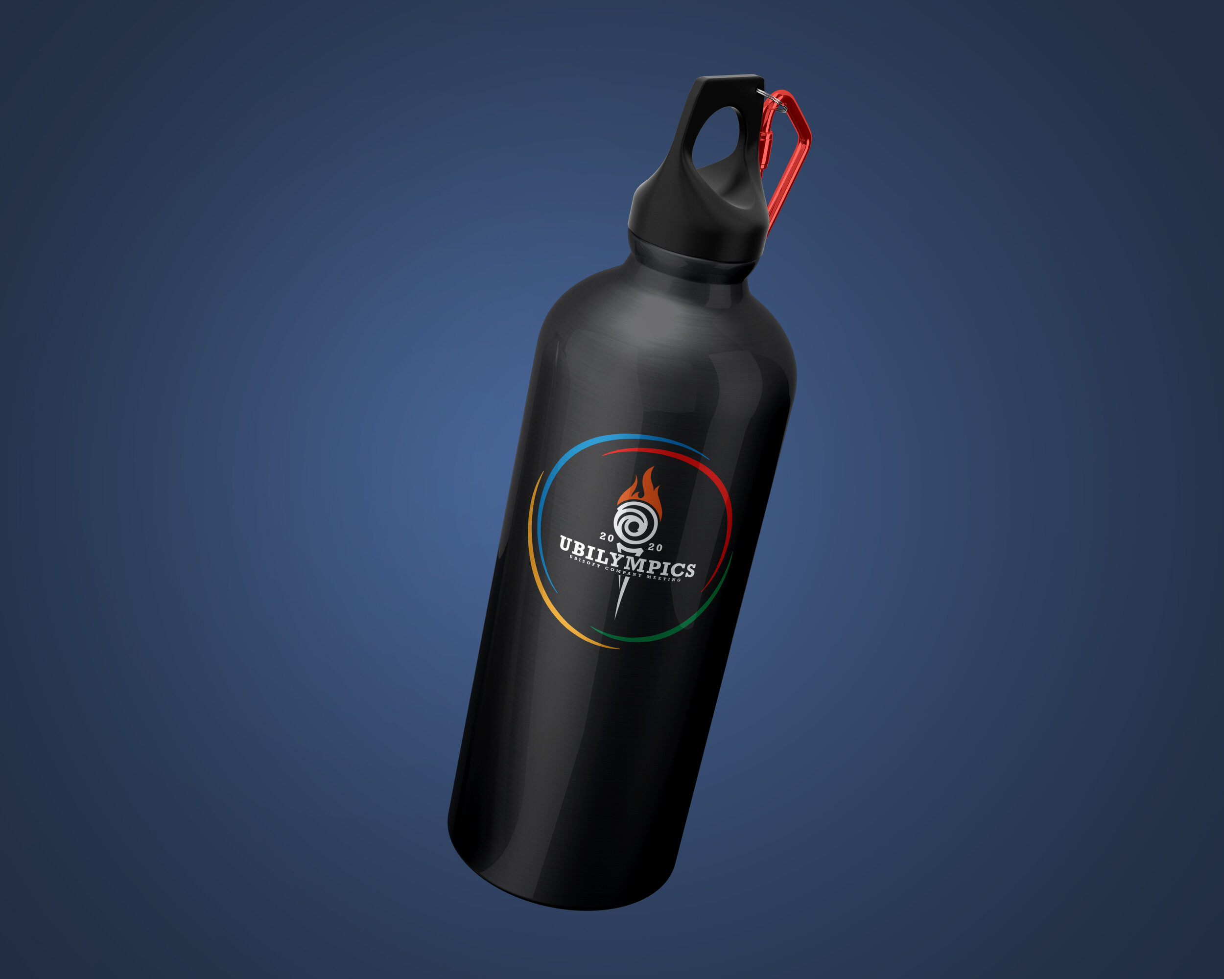
We ultimately landed on a logo that captured all of the feelings surrounding the Olympic Games. The classic colors bring images of the rings to mind while the torch, created out of the Ubisoft logo, is reminiscent of the opening ceremonies and the torch relay. Its comfortable curves and modern slab-serif typeface bring a breath of fresh air to the event and lean into its playful side.
Next Steps
Once we had the logo approved, we began looking forward at what needed to be done next:
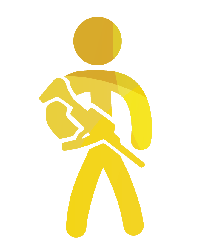
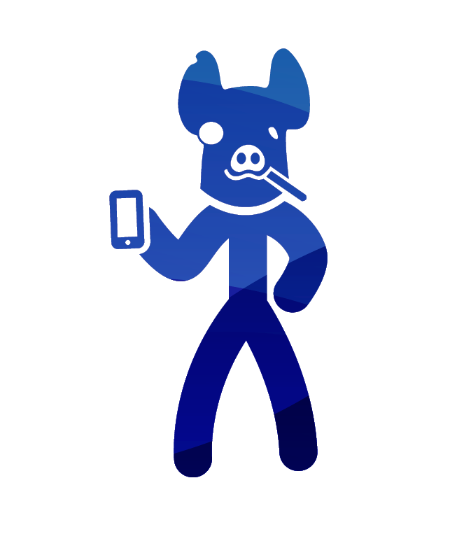
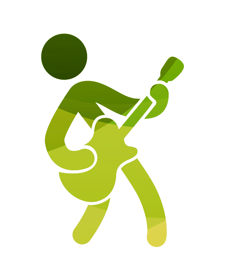
Pictograms - every olympic year, a new set of “pictograms” are designed for the event. As the Olympics are a global event, the pictograms serve as simplified representations of each of the games, allowing for people of any language and background to understand what is being played without the need for words. We wanted to recognize this tradition and create our own set representing the Ubisoft games that were going to be presented at the company meeting.
Invitations
Event graphics
Powerpoint Template + Video Components


Pictograms
The main goal of the pictograms was to simplify the games to their most basic components and use those elements to create recognizable figures. I’m very happy with how they turned out because of how fun, playful, and active they are.
Logo Animation
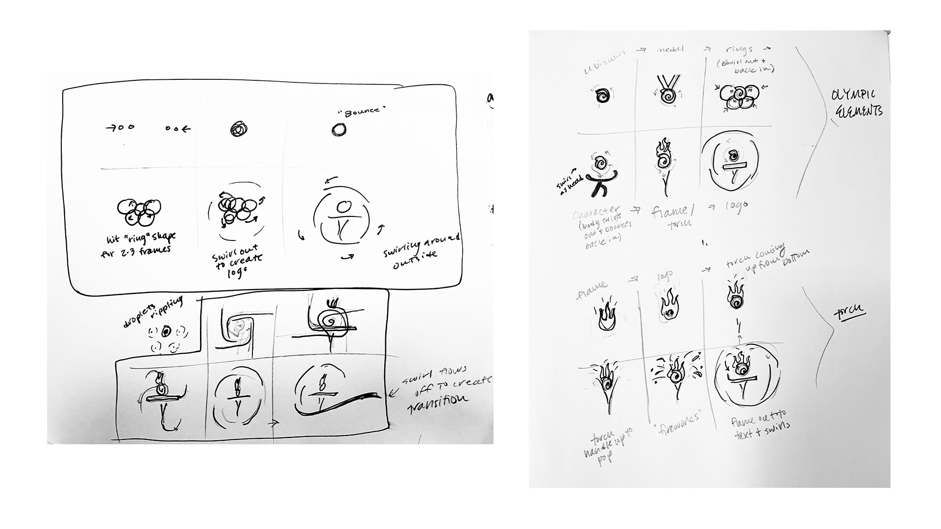
My roll in producing the logo animation for the event was to first find references to base my ideas on and then to sketch story boards that could be passed on to the video services team that they could then produce. The meeting was changed shortly after handing over the story boards, so only one of the options was actually carried out.
*Animation was created by another designer at Ubisoft and I do not take credit for it
Final Mockups